Creating an Impressive Right-to-Left Design
How we develop interfaces for Middle Eastern users Right to left design captures the focus of many creative agencies worldwide. The dynamic business landscape of the Middle East…
Table of Contents
How we develop interfaces for Middle Eastern users
Right to left design captures the focus of many creative agencies worldwide. The dynamic business landscape of the Middle East encourages us to closely monitor the preferences and habits of users in the region. First, that means making specific changes to the app design as writing and reading are done from right to left. Our agency follows the best UI/UX design practices that are good to remember during development.
The difference between LTR (left to right) and RTL (right to left) languages is the direction of the content and, therefore, the navigation. RTL languages include Arabic, Farsi, and Hebrew, with the majority speaking Arabic.
In this framework, the complete design must be mirrored or flipped. Since the navigation now proceeds from right to left, the header controls are mirrored, the back button leads forward, and even slide controls operate in the opposite direction.
We want to tell you how we handle the localization of RTL languages. Let’s cover the fundamentals of the Right to Left design.
Text direction in the right-to-left design
UI elements, titles, and icons flow from right to left. If some parts of your text use LTR wording, phrases, or URLs, they are displayed respectively in the LTR format. Although the rest of the content is written in an RTL language, you follow this rule.
Use the right alignment for the text, including headers.
What if the interface is not mirrored yet, but you must paste the RTL text? In this case, text elements such as the toolbar buttons comply with RTL. Icons are flipped, and the text content is aligned right.

Layout Orientation in the Right to Left Design
The overall layout mirrors the RTL reading direction. Common elements like navigation bars, sidebars, and menus appear on the right side of the screen. Content like articles or main sections should start from the right and flow to the left.

Research indicates that users from the Middle East region respond favorably to RTL progression when presented with content. App designers develop innovative solutions to avoid visually disordered app typography, such as organizing content in a single-column format. By doing so, they can ensure a more cohesive and aesthetically pleasing app design. Some aspects, such as symbols and icon directions, remain consistent in LTR and RTL layouts to accommodate diverse user bases and maintain familiarity across different regions.
Should a UI alter its direction, designers do not mirror the following elements
- Untranslated text or part of it
- Numbers
We expect that UI mirroring causes these changes:
- Icons appear on the opposite side of a space
- The layout reverses navigation buttons
- Icons symbolizing direction (for example, arrows) are mirrored
However, some elements should not be mirrored:
- Icons that don’t mean direction (for instance, a camera)
- Numbers
- Graphs and charts
Icons and symbols:
For clarity, let’s consider the icon design in iOS. With ready SF symbol, you can pick up interface icons for your app, as they already have right-to-left (RTL) languages. When designing custom symbols, you have the flexibility to specify their directionality to ensure consistency and clarity.
If you are dealing with the icons that symbolize reading, right-align the text bars on the icon.
Flip icons depicting motion:

When we need to indicate the direction of movement, we put an icon in the respective RTL frame.
Universal signs do not follow this rule. Put them without any flipping. Logos remain their orientation as well and are not flipped. An example of a universal symbol is a checkmark. The same also works for any items that are intended for right-handed people. Flipping them may confuse readers.
Media progress indicators and playback buttons are not reversed.
- Flipping an element when working on the localized icon version is reasonable. When the app’s UI flips, the flipped version of the icon will perfectly fit it.
- We flip the linear representation of time in RTL, but the circular time symbol remains intact. The same principle works for the symbols with an arrow pointing clockwise — it is not mirrored, and the clockwise direction remains the same regardless of the writing format.
- Progress indicators show the status of an action or process. In the case of RTL design, the progress bar also indicates a right-to-left directionality.
Navigation
The Right to the Left layout switches sides for the navigation and overflow menu.
In the RTL format, we flip page selectors by putting relevant buttons to the right. Upon that, the “Next Page” indicators will be based on the left side. It is recommended to rearrange the numerals showing page numbers. However, putting the page selector in the LTR position makes sense if the primary content is still presented in English or another language with LTR writing.
Let’s consider the text of notifications. The layout and text are adjusted according to the notification language. We align the RTL text to the right.
Usually, operating systems automatically change the alignment of the search input text. The designer’s task is to position UI elements to avoid overlapping.
Rating indication is mirrored — the same works for directional animation, including Carousel.
Numerals
- Choose one type of numeral to be used in the UI. The mixture will be confusing.
- It’s possible to use one of the two ways of writing Arabic numbers: 0 – 9 (Western Arabic) or ٨ ٧ ٦ ٥ ٤ ٣ ٢ ١ ٠ (Eastern Arabic).
- Just like with the text, align numbers to the right.
- Numbers must be read from left to right.


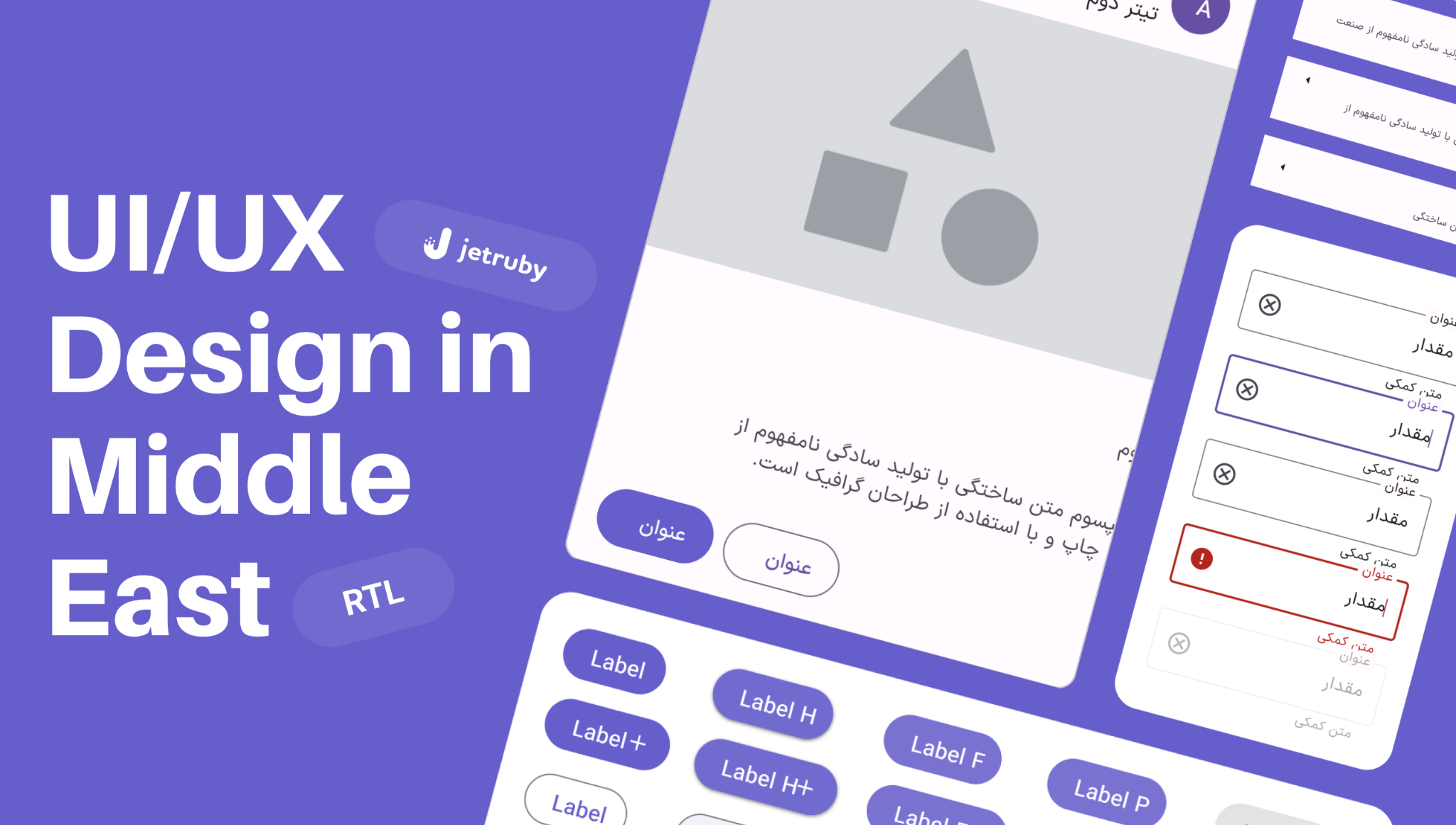
Examples of images created in the Right to Left design format:


Fonts
A recommendation is to keep Arab fonts 1-2 px larger than non-RTL languages. You can increase fonds by about three points. The reason is that Arab letters are more complex and can quickly get less legible if you choose them to be the same size as, for example, English. Of course, words from LTR languages don’t have to be mirrored, but they should be localized.
The comma separator is different in some RTL languages, and as long as it comes to Arabic, you should use the symbol (“،“). Arabic words are shorter, which cuts the final text. Make sure to check out the alignment after the translation is set.
To highlight the text, it is recommended to use overline rather than underlining.
You may consider agreeing on the font type with the client.
Conclusion
In each product’s development, the users should be regarded as real individuals, not mere statistics to check off a list. The initial interaction with the product and its visual presentation largely determines the design’s success. Subsequently, the ease and speed with which users can accomplish their objectives become crucial. Every user interaction with the product must effectively engage and guide them toward their desired outcomes.
Enjoyed the article? Check out other stories about design: