Web App Redesign — UX Case Study
This case study tells you how we helped our technological partner to double sales via the web app redesign app and increase customer satisfaction by around 35%. Our…
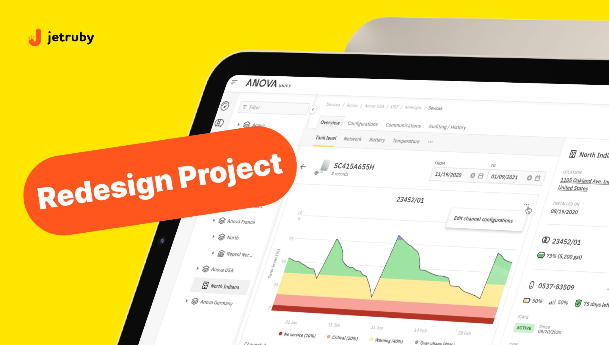
Table of Contents
This case study tells you how we helped our technological partner to double sales via the web app redesign app and increase customer satisfaction by around 35%. Our team meticulously implemented the redesign project for the web app in a technological partnership with Anova — a global leader in remote monitoring of industrial assets.
Background
Since the inception of our partnership in 2019, JetRuby has been an instrumental force in propelling the development of the Anova app. Anova provides remote monitoring systems for different industries on a global scale. Leveraging proprietary IoT fuel control sensors manufactured in-house, the company spreads its reach within the U.S., Mexico, Canada, and beyond. This web app redesign project aimed to improve the app’s fuel monitoring dashboard and encourage fuel sensor sales by creating an intuitive user experience.
The app’s end-user is the fuel supplier (a farmer or logistics company) managing individual or corporate fuel reserves. Hence, they must be aware of the level and need for fuel supplies along the route of the driving truck. Each truck has a fuel sensor that sends the data to the information dashboard, reflecting the fuel consumption data in the app. The “Devices” section of the app required a fundamental transformation and the whole web app redesign to enable more straightforward navigation.
Challenges of the web app redesign
- According to the feedback of the app users, the “Devices” section of the app wasn’t easy to navigate. The customer service was overloaded with repetitive queries.
- The app interface hurdled the onboarding process for new users. Difficult navigation affected customer satisfaction.
It is sufficient to say that only 58% of users managed to scroll all pages to find the needed information.
Project goals
Our business analysts have gathered project requirements before the web app redesign and assisted with formulating principal business goals:
- Elevating device sales: a primary focus was on bolstering sales among existing clients.
- Simplifying interface: intuitive interface design became paramount to ensure effortless user navigation.
- Enhancing customer journeys: The goal was to minimize customer support requests by refining the user experience.
Research and Discovery
At JetRuby, we firmly believe that careful research has a fundamental meaning for the subsequent development and design process.
Therefore, we started with the focus group interview, intending to explore the importance of new options. The target group of 15 users was interviewed to test 5 hypotheses.
A seamless user interaction with all menu options was central to the business objective. But what did this interaction imply?
We did surveys and prioritized a few crucial features. First, the survey results discovered that matching the data of multiple devices is critical to users. Users preferred to check the data of all fuel sensors with one quick overview. Fuel replenishment alerts and malfunction alerts were also on the waiting list.
“We run the interviews with respective focus groups to understand their needs. That’s how we shaped our vision of the app design that will be comfortable and smooth for all categories of end-users.”, said Daria, UX/UI designer.
To summarize, the R&D phase highlighted the critical need for the following features:
- The technical condition of the fuel tank required an overview section. We would raise user awareness about current fuel resources by enabling the data match of several sensors connected to a fuel tank.
- The need for alerts about malfunctions of sensors.
- Other steps that will simplify overall navigation in the web app.
Also, the first tests confirmed the navigation difficulties experienced by 67% of the app users.
User Journey
Mapping the user flow diagram was our next step. This scheme navigated our understanding of how users will interact with new features and check the performance of monitoring devices. We’d been dynamically updating the map throughout the process to ensure that every new option was released as per the UX-first approach.
Our approach to the Web App Redesign
The customization strategy allowed us to solve the needs of each category of users by making every relevant section as informative as possible for them. For example, when a driver needs to check the condition of tank sensors, they will not have to interact with the app as a whole. We concentrated on the design of the following three sections:
- The “Devices” section provides users access to the location and indicators of special sensors linked to each fuel tank.
- The “Tanks” component displays tank parameters for each truck the company manages.
We adhered to atomic design principles, the most appropriate tactic for organizing apps with complex functions. It means we started developing minor elements and then combined them as components of a more extensive system. When the user opens the app, they won’t be puzzled by an extended menu and will be easily navigated by its simple structure.
Web app redesign process
1) Easy folding of sections. Previously, all fuel sensors belonging to the same tank were not displayed in a single space. The design showed stats on one tank at a time. The right sidebar could not be folded. The user had to view each sensor separately. We organized a single space from where you can see how the tank performs and match the data between all sensors connected to this tank.
Now, the sidebar shows all tanks. Also, any section can be easily folded.

This way, all stats on the chosen tank are available to the user, and they can match it with other tanks’ data without leaving the page.
2) Quick search enabled. Initially, device filters were hidden in the right-side panel. We put them inside the table to allow a quick search of needed elements.

3) Spreadsheet and scroll. The buttons of the top menu bar were scattered across the space. Also, the pagination didn’t have a fixed position. The top menu bar was not present.
The page now has a fixed position of the top menu bar; the table has a header and pagination. You can scroll up/down, left/right inside the table. This step enhanced usability and speed.
4) Alerts. We enabled alerts about the fuel tank malfunction. The alert option cut the average response time from 48 hours to 1 hour, which now the fuel suppliers take for troubleshooting.
5) More is less. The top menu buttons were arranged on the right side. By clicking on the “More” button, one can access additional options – this way, we kept up with a “clean design idea.”
When the first layouts were created, it was the right time to test three design options with various groups of users (drivers, employees, and engineers) within the platform. We opted for the multivariate test, proposing several solutions. This approach allowed us to sift through possible options and carefully craft the optimal design solution for all categories of users. According to the test results, the second design option was the top choice of all categories of users (with 71.8% of respondents voting for it). We shared this result with our customer and made minor adjustments to the design layout No. 2. After that, this design version was delivered for development.
The positive impact of UX optimization
Through a series of strategic changes in the UI/UX design, Anova doubled its sales volume of fuel monitoring devices and substantially reduced its customer service workload.
Incorporating new and highly anticipated features, a streamlined menu bar, and an enhanced filter system reshaped the app design.
Customers were enticed by the new functionalities and found navigation through the product ecosystem considerably more intuitive. This shift boosted customer satisfaction and catalyzed the surge in sales volume: Anova has doubled the sales of monitoring devices.